Product Packaging Design
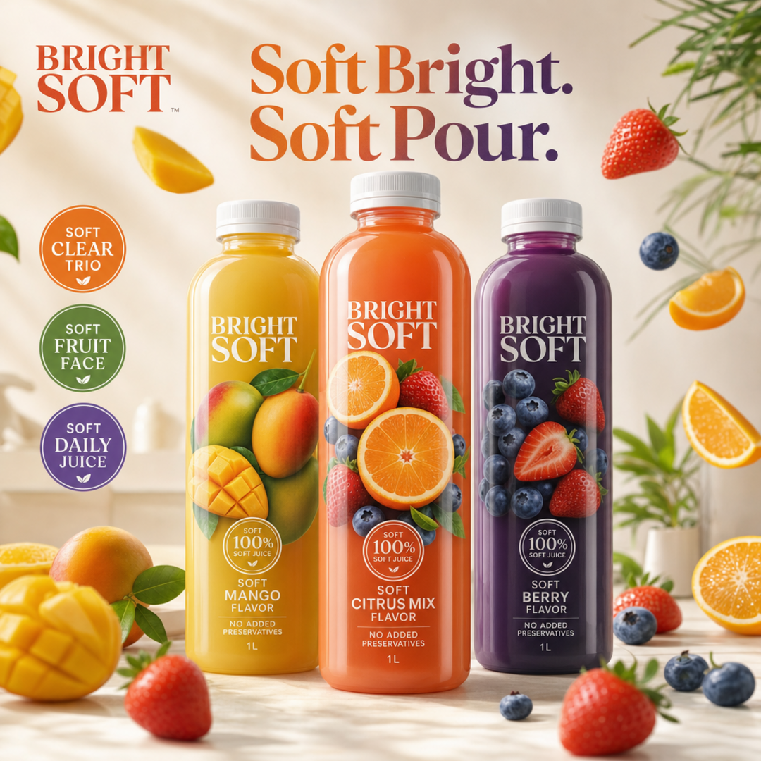
Bright Soft Clear Juice Trio
Three Soft Clear Juice bottles with floating fruit theatre and Soft Bright. Soft Pour. callouts.
Client Bright Soft
Description
Bright Soft is a fictional soft juice house for Soft Clear Juice: a redesigned three-SKU clear bottle family (Soft Mango, Soft Citrus Mix, Soft Berry) with original BRIGHT SOFT wordmark, Soft 100% Soft Juice hierarchy matching each flavor correctly, Soft No Added Preservatives Soft 1L cues — never juicy bliss lockups, mismatched orange seals as client identity, phones, emails, QR codes, or ORDER NOW bars. We staged the trio as hero on soft studio stone, then floated mango, citrus, and berry props outside the packs with exterior badges for Soft Clear Trio, Soft Fruit Face, and Soft Daily Juice so the collection tile reads as soft clear juice lifestyle theatre, clearly distinct from Formora, Petal Soft, Zest Peak, and neighbouring beverage packs. Soft packaging storytelling only.
Related services
Design storytelling
From brief to designed solution
Ideation concept
Keep clear photo-wrap juice bottle trio energy as the concept — invent Bright Soft (never juicy bliss). Outside the dielines, floating fruit props plus Soft Bright. Soft Pour. lift into a Colgate-style 1080 lifestyle poster.
Problem statement
Clear juice boards often lock juicy bliss marks or paste barren white bottle crops with mismatched flavor seals into portfolio decks. The brief needed an original fictional soft clear juice brand, redesigned three-SKU hierarchy, and a square 1080 enriched lifestyle poster.
Solution
We invented Bright Soft Clear Juice Trio, rebuilt hierarchy around BRIGHT SOFT → Soft Clear Juice → Soft Mango Soft Citrus Soft Berry, and validated an exactly 1080×1080 enriched lifestyle packshot; formora neighbour left untouched.
Keep browsing
Explore other categories
Swipe through more selections from other categories and industries — open anything that fits your next brief.
Other category
Stationery Design


Other category
Custom Design


Industry pick
FMCG


Industry pick