
Stationery Design


/
Seravine Jewelry Stationery Display Kit
SKU PXRT-2497
Cream-and-gold jewelry stationery suite on camel fabric with necklace tags, stud cards, and care-tip callouts. Plus enriched open-frame gallery stills.
Client Seravine
Description
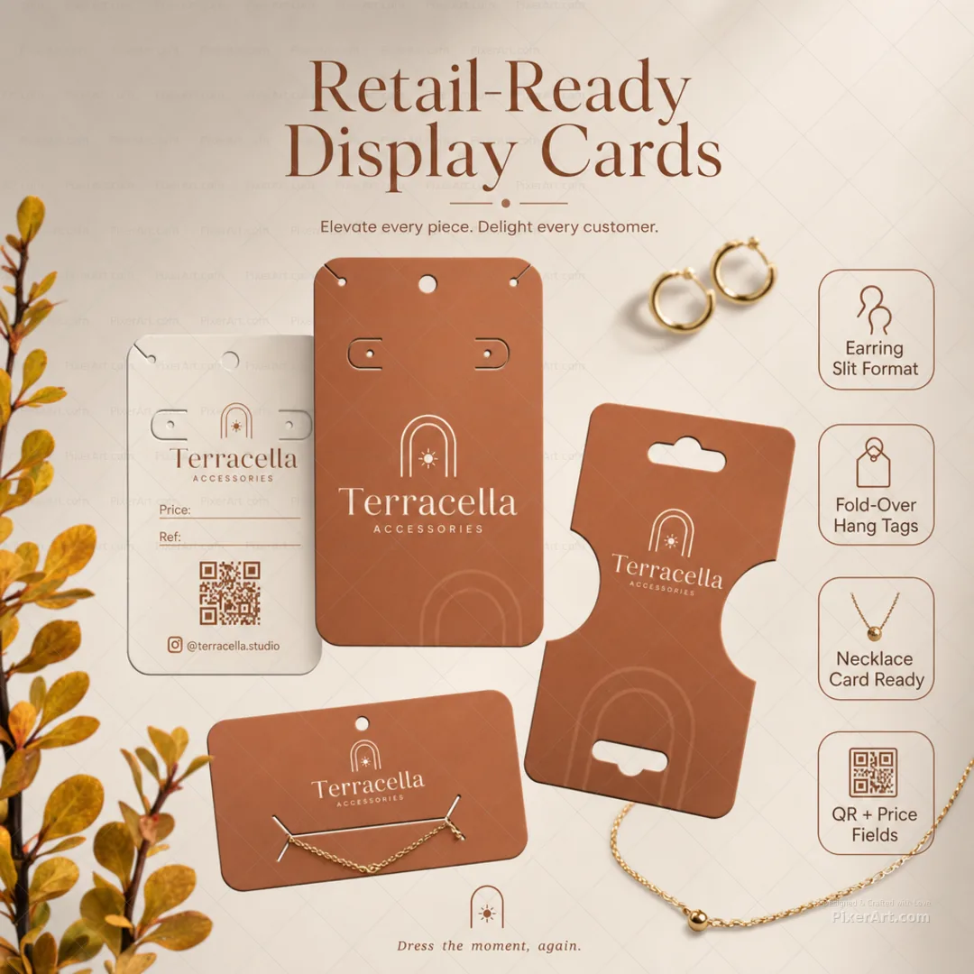
Seravine is a fictional fine-jewelry house needing a complete in-store and unboxing stationery system. We redesigned a cream cardstock kit on warm camel fabric — logo card with original crescent-and-pearl emblem, care-tips card in English, necklace hang tags with corner slits, earring stud cards, foldable price tags, and long bracelet display strips with punch holes — then staged floating gold chain, pearl studs, silk ribbon, and soft fabric folds outside the card set with exterior badges for Retail-Ready Display Cards, Gold-Foil Brand Touch, Care Tips Included, and Necklace & Stud Formats so the collection tile reads as boutique jewelry print media, distinct from pack-carton unboxing neighbours. Companion gallery adds enriched lifestyle keyline, fold, assembled, and open-frame presentation stills at hero mockup quality.
Related services
Design storytelling
From brief to designed solution
Ideation concept
Camel fabric warmth as the luxury signal: cream paper, gold foil accents, and elegant script hierarchy — but invent Seravine as the brand world with crescent-and-pearl mark, Fine Jewelry & Accents subline, and @seravine.studio as fictional contact only. Outside the dieline, necklace, studs, ribbon, and margin callouts lift a stationery flatlay into a square enriched portfolio poster — every piece deserves a moment.
Problem statement
Independent jewelry makers often ship with placeholder logos, cloned flower-star marks, or real social handles baked into mockups. The brief needed an original fictional brand, a redesigned cream-and-gold stationery kit with necklace, stud, and bracelet formats, and a square 1080 enriched lifestyle poster with jewelry props and external typography — clearly distinct from pack-carton unboxing pieces and third-party print-shop watermarks.
Solution
We invented Seravine, rebuilt the kit around crescent mark → Seravine script → Fine Jewelry & Accents, authored English care tips with fictional @seravine.studio contact, and validated an exactly 1080×1080 enriched lifestyle poster with floating chain, pearl studs, ribbon, and exterior benefit callouts. Stationery, print-media, and brand-suite tags mark the work for collection filters. We also shipped a 3–4 frame enriched open-frame packaging set at hero mockup quality.
Keep browsing
Explore other categories
Swipe through more selections from other categories and industries — open anything that fits your next brief.
Other category
Product Packaging Design


Other category
Custom Design


Industry pick
Startup / D2C


Industry pick


