Product Packaging Design
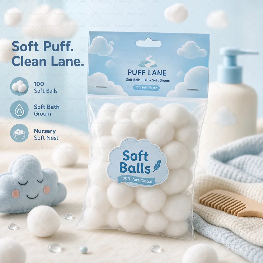
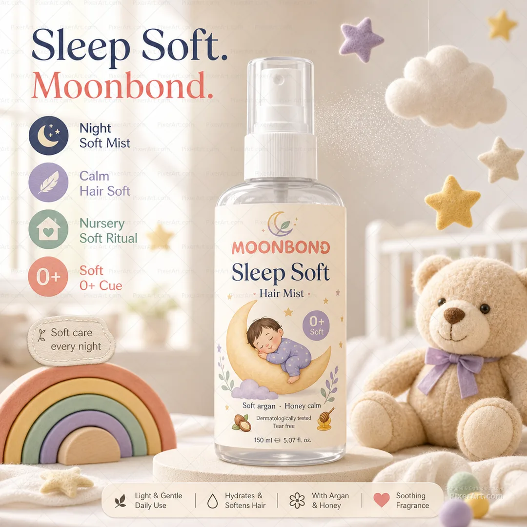


/
Scoop Kind Squeeze Soft Feeder
SKU PXRT-3117
Coral and sky squeeze feeder duo with carton theatre and Squeeze Soft. Easy Feed. callouts. Plus enriched open-frame gallery stills.
Client Scoop Kind
Description
Scoop Kind is a fictional baby feeding-care house for Squeeze Soft Feeder: redesigned coral-orange and sky-blue matte soft-touch squeeze bottles with clear conical necks and integrated clear soft spoon tips, plus a cream retail carton with an original scoop-curve crest, SCOOP KIND wordmark, Squeeze Soft Feeder hierarchy, One-Hand Soft Feed cue, and BPA Soft Silicone language — never generic gadget montage clones, Medium SVG promo chrome, Amazon contact bars, or ORDER NOW ribbons. We staged the dual-color feeders and carton as the hero set on warm cream linen, then floated puree dollops, carrot coins, banana slices, eucalyptus, and muslin outside the packs with exterior badges for One-Hand Soft Feed, BPA Soft Silicone, Clear Spoon Tip, and Duo Color Ritual so the collection tile reads as bright squeeze-feeder lifestyle theatre, clearly distinct from Pulse Path wearable pumps, Dew Latch manual pumps, Bright Chill coolers, Halo Nest and Plume Soft nursing pads, and neighbouring baby packs shipping in parallel. Soft baby-feeding packaging storytelling only. No phones, emails, QR codes, Instagram handles, or watermark text appear as client identity in copy or artwork. Companion gallery adds enriched lifestyle keyline, fold, assembled, and open-frame presentation stills at hero mockup quality.
Related services
Design storytelling
From brief to designed solution
Ideation concept
Keep squeeze-to-feed silicone spoon bottle energy, dual coral/sky color coding, clear spoon tip puree reveal, and one-hand feeding convenience as the concept — but invent Scoop Kind as the brand spine with Squeeze Soft Feeder hierarchy and an original scoop-curve crest (never generic invention-montage clones or contact chrome). Outside the dielines, floating puree/fruit props plus Squeeze Soft. Easy Feed. lift the duo into a Colgate-style enriched 1080 lifestyle poster. Soft baby-feeding language only.
Problem statement
Baby squeeze-feeder boards often arrive as split-panel product dumps or generic invention montages without a brand system. The brief needed an original fictional feeding brand, redesigned dual-color squeeze spoon hierarchy treating bottles plus carton as one hero, soft one-hand feed storytelling, and a square 1080 enriched lifestyle poster with floating props and external typography — without overwriting Pulse Path, Dew Latch, Bright Chill, Halo Nest, Plume Soft, or parallel baby-care neighbours.
Solution
We invented Scoop Kind Squeeze Soft Feeder, rebuilt hierarchy around scoop-curve crest → SCOOP KIND → Squeeze Soft Feeder → One-Hand Soft Feed / BPA Soft Silicone → coral + sky duo + carton, and validated an exactly 1080×1080 enriched lifestyle packshot: dual feeders and carton as hero, floating puree/fruit props, and Squeeze Soft. Easy Feed. margin callouts outside the dielines. Packaging and baby-care tags mark the work for collection filters; artwork forced to precisely 1080×1080 with no ORDER NOW, phones, emails, QR, Instagram, or watermark identity; pulse-path-wearable-pump-duo, dew-latch-manual-milk-pump, bright-chill-milk-cooler, halo-nest-nursing-pads, plume-soft-nursing-pads, and parallel neighbour slugs left untouched. We also shipped a 3–4 frame enriched open-frame packaging set at hero mockup quality.
Keep browsing
Explore other categories
Swipe through more selections from other categories and industries — open anything that fits your next brief.
Other category
Stationery Design


Other category
Custom Design


Industry pick
FMCG


Industry pick


