Product Packaging Design


/
Popmora Family Flavor Popcorn Quartet
SKU PXRT-2624
Four color-coded family popcorn pouches with wooden bowl heroes, floating kitchen props, and Share the Pop. callouts. Plus enriched open-frame gallery stills.
Client Popmora
Description
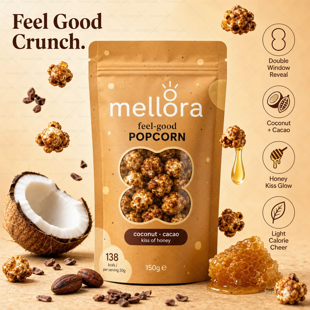
Popmora is a fictional flavoured popcorn house built as a redesigned four-SKU stand-up pouch family: Verdant Chilli in lime green, Butter Cheddar in sunny yellow, Beet Herb Glow in magenta-purple, and Peri Ember in tomato red. Each matte pouch carries a POPMORA lockup with kernel mark, SHARED TABLE badge, bold POP CORN title, dynamic ingredient illustration, wooden bowl of color-matched popcorn, and Gluten Free / Plant Based footer icons — then stages floating chillies, cheese, butter, beetroot, herbs, peri chillies, and multicolour kernels outside the packs with margin badges for Four Flavor Family, Kitchen Bowl Hero, Color-Coded Fun, and Plant-Based Crunch so the collection tile reads as playful family-table popcorn theatre, clearly distinct from third-party family-pouch popcorn trademarks, Puffora monster-window popcorn, Showora cinema-bucket pouches, Mellora coconut-cacao honey pouches, and neighbouring chip/namkeen concepts shipping in parallel. Companion gallery adds enriched lifestyle keyline, fold, assembled, and open-frame presentation stills at hero mockup quality.
Related services
Design storytelling
From brief to designed solution
Ideation concept
Keep color-coded family popcorn pouch energy, SHARED TABLE-style subline, big POP CORN hierarchy, central ingredient splash, wooden bowl appetite, certification icons, and kitchen lifestyle staging as the concept — but invent Popmora as the brand spine with original English flavours (Verdant Chilli / Butter Cheddar / Beet Herb Glow / Peri Ember). Outside the dielines, floating popcorn and ingredient props plus exterior lines — POPMORA · SHARE THE POP. and FOUR FLAVORS. ONE FAMILY TABLE. — lift the quartet into a Colgate-style enriched 1080 poster without third-party popcorn trademarks or studio watermarks.
Problem statement
Family flavoured popcorn pouch boards often lock third-party snack trademarks, cloned script logos and bowl-crop artwork, and sterile pack-only grids into portfolio decks. The brief needed an original fictional popcorn brand, redesigned four-flavour pouch system with readable SHARED TABLE storytelling, and a square 1080 enriched lifestyle poster with floating props and external typography — distinct from Puffora monster-window popcorn, Showora cinema buckets, Mellora feel-good pouches, Thai chip ranges, juice cartons, sprouted nut pouches, instant-noodle packshots, and other parallel packaging slugs.
Solution
We invented Popmora, rebuilt hierarchy around POPMORA → SHARED TABLE → POP CORN → flavour name → wooden bowl hero → Gluten Free / Plant Based, and validated an exactly 1080×1080 enriched lifestyle packshot: full four-pouch set as hero, floating kitchen flavor props, and Share the Pop. / Four Flavors. One Family Table. margin callouts outside the dielines. Packaging and snacks/FMCG tags mark the work for collection filters; artwork forced to precisely 1080×1080 with no third-party popcorn trademarks or watermark text. We also shipped a 3–4 frame enriched open-frame packaging set at hero mockup quality.
Keep browsing
Explore other categories
Swipe through more selections from other categories and industries — open anything that fits your next brief.
Other category
Stationery Design


Other category
Custom Design


Industry pick
FMCG


Industry pick


