


Product Packaging Design


/
Driftwell Cycle Soft Tablets
SKU PXRT-2894
Plum–teal women’s Cycle Soft carton + blister with floating bloom theatre and Cycle Soft. Steady Lining. callouts. Plus enriched open-frame gallery stills.
Client Driftwell
Description
Driftwell is a fictional women’s-health pharmacy house for Cycle Soft Tablets IP 10 mg: a redesigned white matte carton with deep-plum side panel, geometric crescent-bloom crest, DRIFTWELL wordmark, bold CYCLE SOFT hierarchy, Tablets IP 10 mg cue, Supports healthy lining rhythm* soft-claim line, lavender–teal botanical climb art (never anatomical uterus clones), and 10 × 10 Tablets footing — never Narson Pharmaceuticals lockups, EXPORT AVAILABLE ribbons, WHO/GMP seal chrome, or contact footers. We staged carton + silver blister as the hero set on soft stone under leaf-shadow daylight, then floated loose white tablets, purple and teal blooms, green leaves, a lavender ribbon loop, and dew droplets outside the packs with exterior badges for Menstrual Comfort*, PMS Soft Support*, Fertility-Friendly Rhythm*, and Carton + Blister Set so the collection tile reads as plum–teal women’s-cycle lifestyle theatre, clearly distinct from Ovulivra RatioWeave inositol sticks, Matrivra Nestlight prenatal multis, Gestivra Bloomtide DHA softgels, Nestuva midstream tests, Soft Vale Quiet Wave dual tablets, Rootlane Follic Rise tablets, and neighbouring Rx/OTC packs shipping in parallel. Soft menstrual-comfort and lining-rhythm packaging storytelling only — portfolio fiction, not disease-cure advertising. No Narson Group, phones, emails, QR codes, Instagram handles, or copyright bars appear as client identity in copy or artwork. Companion gallery adds enriched lifestyle keyline, fold, assembled, and open-frame presentation stills at hero mockup quality.
Related services
Design storytelling
From brief to designed solution
Ideation concept
Keep dydrogesterone-category women’s-health carton + blister energy, plum/teal colour discipline, soft menstrual / PMS / fertility-friendly lining callouts, and clinical-warm lifestyle calm as the concept — but invent Driftwell as the brand spine with Cycle Soft hierarchy and an original crescent-bloom crest (never Narson lockups, EXPORT ribbons, WHO/GMP clones, anatomical uterus-on-pack clones, or contact footers). Outside the dielines, floating tablet/bloom/ribbon props plus exterior headline Cycle Soft. Steady Lining. lift the carton-and-blister set into a Colgate-style enriched 1080 lifestyle poster without third-party manufacturing marks or studio watermarks. Soft care language only.
Problem statement
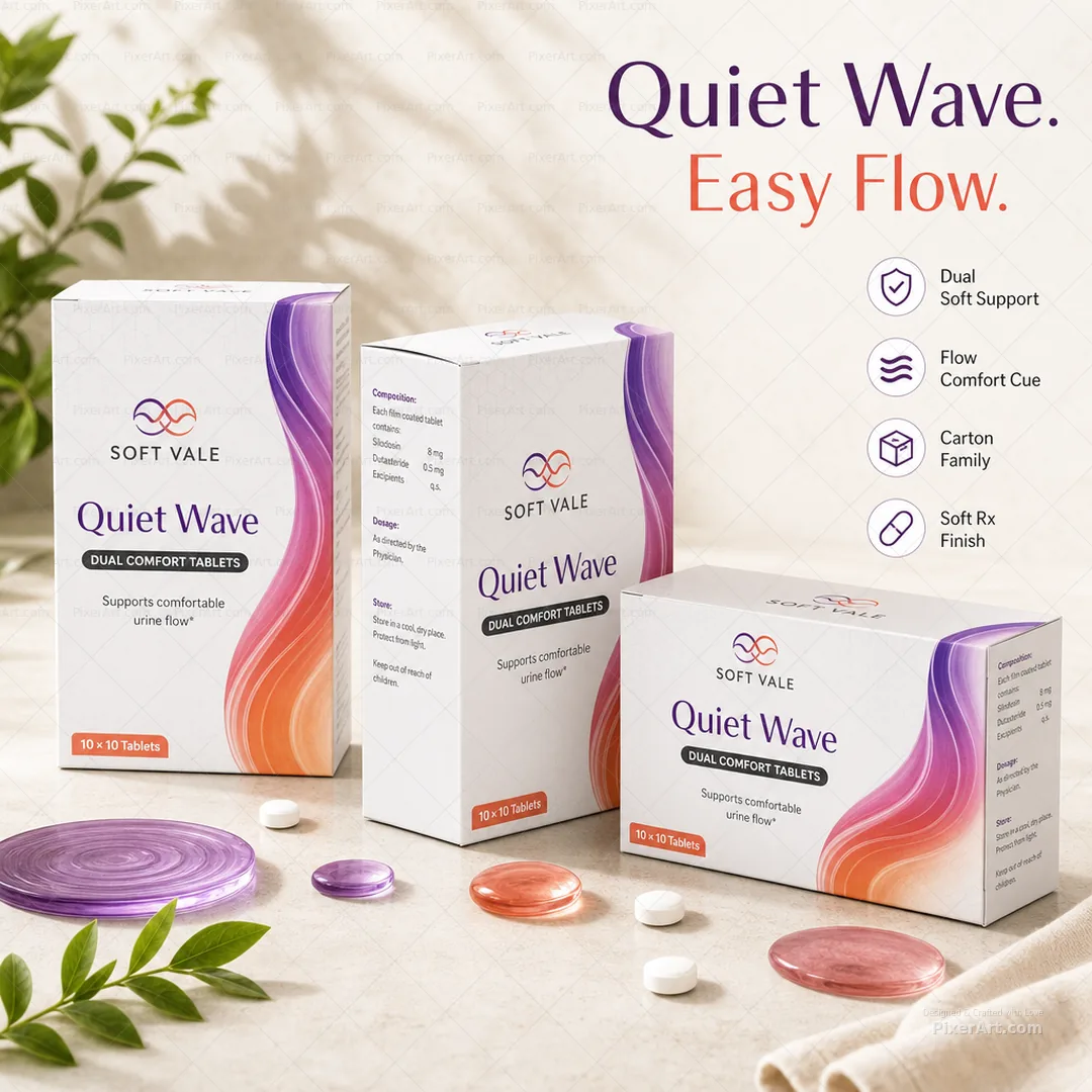
Women’s progesterone-tablet boards often lock manufacturing promo names (Narson Pharmaceuticals), clone plum/teal carton-plus-blister art as-is with EXPORT ribbons, WHO/GMP seals, and phone/email footers, and leave barren pack-on-white crops in portfolio decks. The brief needed an original fictional women’s Cycle Soft tablet brand, redesigned carton-plus-blister hierarchy treating the full set as hero, soft menstrual-comfort storytelling, and a square 1080 enriched lifestyle poster with floating props and external typography — distinct from Ovulivra / Matrivra / Gestivra / Nestuva women’s-health neighbours and other parallel Rx packs.
Solution
We invented Driftwell Cycle Soft, rebuilt hierarchy around crescent-bloom crest → DRIFTWELL → CYCLE SOFT → Tablets IP 10 mg → Supports healthy lining rhythm* → 10 × 10 Tablets + blister companion, and validated an exactly 1080×1080 enriched lifestyle packshot: carton + blister as hero, floating tablet/bloom/ribbon props, and Cycle Soft. Steady Lining. margin callouts outside the dielines. Packaging, pharmaceutical, wellness, and mockup-presentation tags mark the work for collection filters; artwork forced to precisely 1080×1080 with no Narson, EXPORT, WHO/GMP, phones, emails, QR, Instagram, or watermark identity; Ovulivra, Matrivra, Gestivra, Nestuva, Soft Vale, Rootlane, and parallel neighbour slugs left untouched. We also shipped a 3–4 frame enriched open-frame packaging set at hero mockup quality.
Keep browsing
Explore other categories
Swipe through more selections from other categories and industries — open anything that fits your next brief.
Other category
Stationery Design


Other category
Custom Design


Industry pick
Pharmaceutical


Industry pick


