
Product Packaging Design


/
Stillvra SoftRise Dual Cartons
SKU PXRT-2793
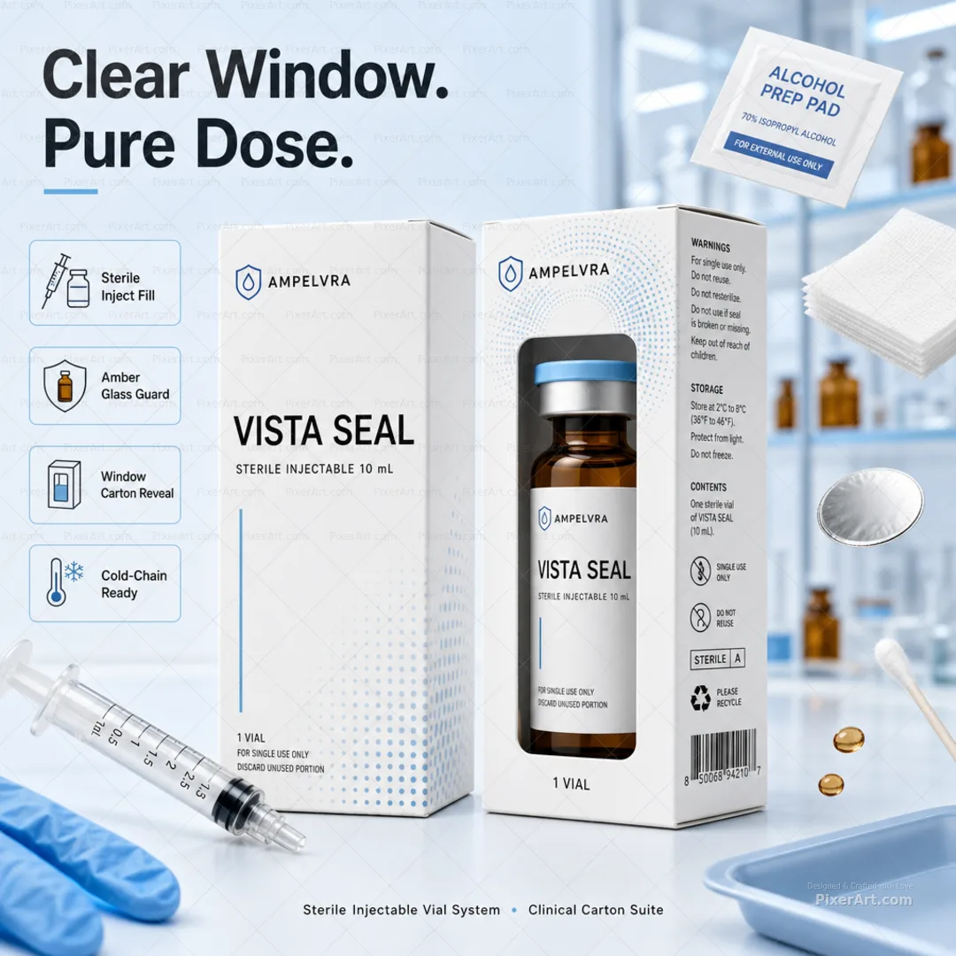
Pastel clinical SoftLume + SoftTide analgesic carton pair with floating calm props and Soft Rise. Quiet Ease. callouts. Plus enriched open-frame gallery stills.
Client Stillvra
Description
Stillvra is a fictional OTC quiet-relief house for SoftRise Quiet Ease Tablets: a redesigned dual-concept pastel blue/white/black pharmacy carton family with high-contrast serif STILLVRA lockups, SoftRise hierarchy, clean English side architecture (Active Support · Tablets 20 · Drug Facts · barcode — never DAND nene / 99E3 gibberish), and two readable design directions kept as one family — SoftLume horizontal-split clarity mark with soft lumen-petal arch art, and SoftTide inverted-split calm back-figure-in-water line art with a soothed upper-back cue — never Pain End identity or loud pharmacy-red aggression. We staged both concept cartons as hero, then floated white soft-gels, eucalyptus, lavender, crushed ice, linen, wooden massage roller, and cool gel pack outside the packs with exterior badges for Dual Concept Family, Clinical Calm Blue, SoftLume + SoftTide, and Quiet Pharmacy Aesthetic so the collection tile reads as thoughtful clinical-calm analgesic theatre, clearly distinct from Cephora migraine cartons, Ostivra joint gels, Flexivra muscle tablets, Algivra mint raft sachets, Balmvora healing ointment, Snivora kids allergy liquid, Capylora hair tablets, Florivra flora capsules, and neighbouring OTC packs shipping in parallel. Companion gallery adds enriched lifestyle keyline, fold, assembled, and open-frame presentation stills at hero mockup quality.
Related services
Design storytelling
From brief to designed solution
Ideation concept
Keep dual OTC analgesic carton exploration energy, pastel blue/white/black clinical minimalism, high-contrast serif brand mark, barcode/side-facts structure, SoftLume horizontal-split clarity panel vs SoftTide inverted-split calm back-in-water panel, and quiet thoughtful relief storytelling as the concept — but invent Stillvra as the brand spine with SoftRise / Quiet Ease hierarchy and redesigned lumen-petal + SoftTide art (never Pain End lockups, cloned lightbulb/smiley art, or gibberish placeholder strings). Outside the dielines, floating calm clinical props plus exterior headline Soft Rise. Quiet Ease. lift the dual cartons into a Colgate-style enriched 1080 lifestyle poster without third-party analgesic trademarks or studio watermarks.
Problem statement
Analgesic carton boards often lock reference brand names (Pain End), clone dual pastel clinical mockups with abstract lightbulb and back-figure panels as-is, leave gibberish side strings (DAND nene / 99E3), and barren dual-panel crops into portfolio decks. The brief needed an original fictional quiet-ease tablet brand, dual SoftLume + SoftTide concept hierarchy treating both cartons as hero, clean English pharmacy copy, and a square 1080 enriched lifestyle poster with floating calm props and external typography — distinct from migraine cartons, joint gels, muscle-relaxant tablet duos, antacid sachets, antifungal red packs, fever patches, and other OTC neighbours shipping in parallel.
Solution
We invented Stillvra SoftRise, rebuilt hierarchy around STILLVRA → SoftRise → Quiet Ease Tablets · 20 → SoftLume clarity vs SoftTide back-comfort dual directions → clinical side facts, and validated an exactly 1080×1080 enriched lifestyle packshot: both concept cartons as hero, floating gel/eucalyptus/lavender/ice/massage props, and Soft Rise. Quiet Ease. margin callouts outside the dielines. Packaging and pharmaceutical tags mark the work for collection filters; artwork forced to precisely 1080×1080 with no Pain End identity, gibberish strings, or watermark text; Cephora, Ostivra, Flexivra, Algivra, Balmvora, Snivora, Capylora, Florivra, and parallel OTC neighbour slugs untouched. We also shipped a 3–4 frame enriched open-frame packaging set at hero mockup quality.
Keep browsing
Explore other categories
Swipe through more selections from other categories and industries — open anything that fits your next brief.
Other category
Stationery Design


Other category
Custom Design


Industry pick
Pharmaceutical


Industry pick


